
Est. in 1869, Celebrated in 2019
The year 2019 is a special year for Staropramen. And for Cocoon, it was special-squared. The 150th Staropramen Anniversary Edition designs were created in our studio both for the local and global portfolios.
At Cocoon, we are honoured to have our signature on the face of Staropramen in the Czech Republic as well as in the more than 30 countries the brewery exports to. In most of them there was a chance to celebrate and proudly share the extraordinary “150” number.
IN THE WORLD...

The global logo for the 150th Anniversary reflects the origin of Staropamen beer: the historical city of Prague. To reference the Orloj Astronomical clock known worldwide, we created a golden, elegant, and beautifully-crafted logo. To underline the premium spirit of this brand, the result is festive, decorative, and visually matches the brand identity and personality. At the same time, it is striking and attracts attention. Additionally, there was another reason to utilize the Orloj clock: to support the global communication message of the campaign, “Making every moment count.”

We treated the golden logo as an identity. It was applied and rolled-out to RGB labels, cans, anniversary multipacks, special edition POCMs, and many other touch-points. The logo also became a “carrier” of the celebration message in ATL and BTL global communication.

By the way, preparing the artworks for more than 20 countries all over the world… well, it was definitely a great and successful challenge for our project management!
And our favourite piece? The Limited Edition cans, which were designed to stand alone as separate designs as well as one cohesive message.
AT HOME...
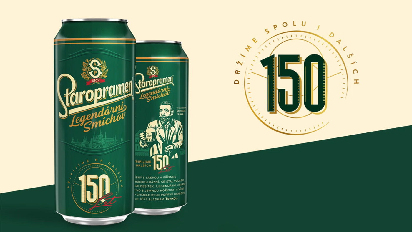
The local logo was the same grand story told in a slightly different way. We wanted to celebrate the anniversary while fully respecting the identity of the brand. And to help convey the communication message of Staropramen, which was beautifully executed in ATL and BTL channels.

Staropramen’s heritage is strongly bound to the Smíchov quarter of Prague, its community of drinkers, and the story of the “industrial revolution miracle”, which Staropramen is surely defined by. The logo was designed to match this spirit with more boldness and confidence, yet keep a simple elegance and distinction.
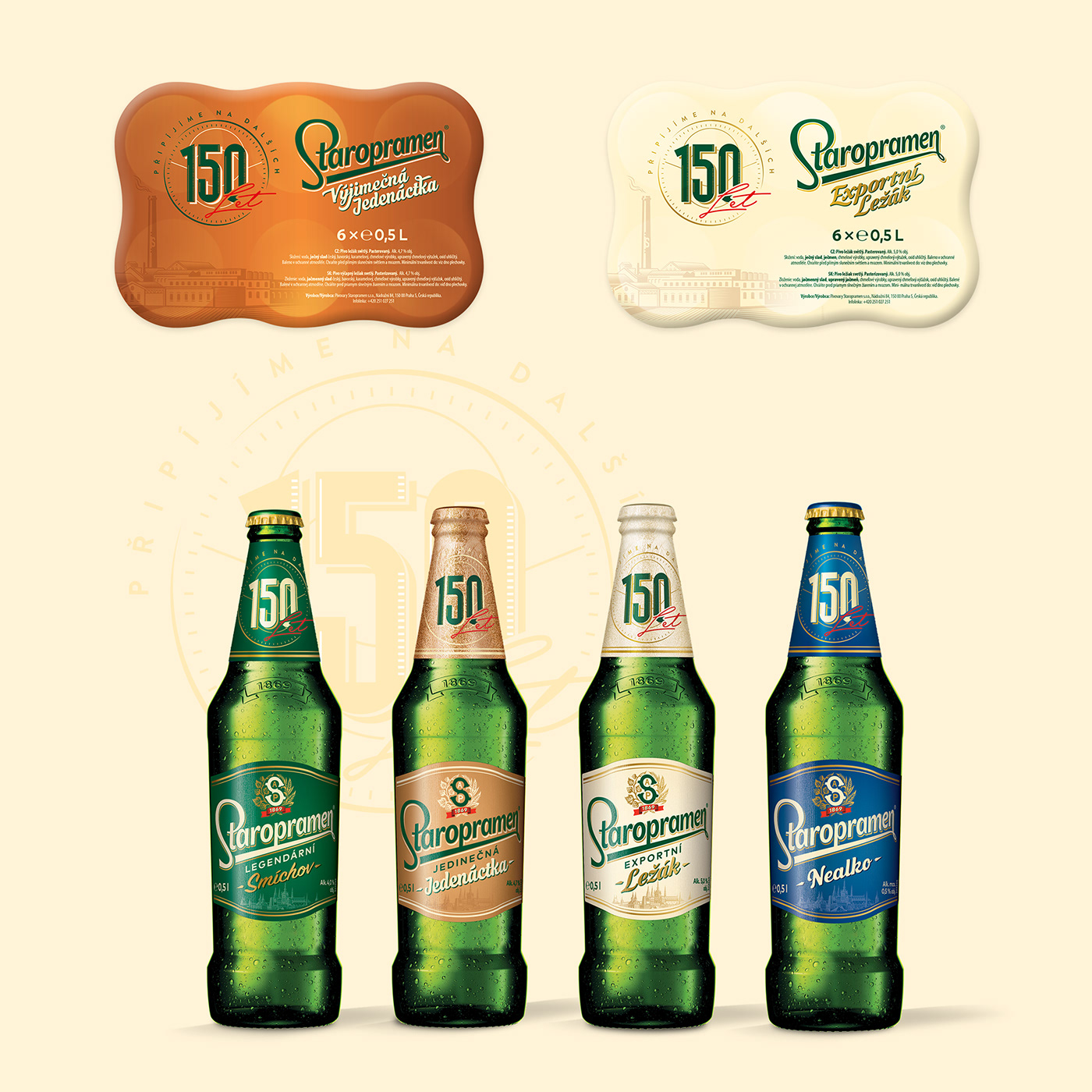
For this logo, we have also prepared a complete roll-out of applications on the core lager as well as on the extensions, labels, cans, and secondary packaging. Just like in the global application, we crafted the limited edition versions of the cans. Original illustrations of the brewmasters, who played a major role in Staropramen’s history and craft, were designed at Cocoon. The work successfully tells the unique story of these extensions and offers a toast to both the traditional and modern things to come under the name of the Smíchov Brewery.
So, we raise our glasses (computer mice, and tablet pens) to toast Staropramen for this exceptional milestone in its history.


